Visualizations Overview
Performance profiles originate either from the user’s own means (i.e. by building their own collectors and generating the profiles w.r.t Specification of Profile Format) or using one of the collectors from Perun’s tool suite.
Perun can can interpret the profiling data in several ways:
By directly running interpretation modules through
perun showcommand, that takes the profile w.r.t. Specification of Profile Format and uses various output backends (e.g. Bokeh, ncurses or plain terminal). The output method and format is up to the authors.By using python interpreter together with internal modules for manipulation, conversion and querying the profiles (refer to Profile API, Profile Query API, and Profile Conversions API) and external statistical libraries, like e.g. using pandas.
The format of input profiles has to be w.r.t. Specification of Profile Format, in particular the interpreted profiles should contain the resources region with data.
Automatically generated profiles are stored in the .perun/jobs/
directory as a file with the .perf extension. The filename is by default
automatically generated according to the following template:
bin-collector-workload-timestamp.perf
Refer to Command Line Interface, Automating Runs, Collectors Overview and Postprocessors Overview for more details about running command line commands, generating batch of jobs, capabilities of collectors and postprocessors techniques respectively. Internals of perun storage is described in Perun Internals.
Note that interface of show allows one to use index and pending tags of
form i@i and i@p respectively, which serve as a quality-of-life feature
for easy specification of visualized profiles.

Supported Visualizations
Perun’s tool suite currently contains the following visualizations:
Bars Plot visualizes the data as bars, with moderate customization possibilities. The output is generated as an interactive HTML file using the Bokeh library, where one can e.g. move or resize the graph. Bars supports high number of profile types.
Flow Plot visualizes the data as flow (i.e. classical continuous graph), with moderate customization possiblities. The output is generated as an interactive HTML file using the Bokeh library, where one can move and resize the graph. Flow supports high number of profile types.
Flame Graph is an interface for Perl script of Brendan Gregg, that converts the (currently limited to memory profiles) profile to an internal format and visualize the resources as stacks of portional resource consumption depending on the trace of the resources.
Scatter Plot visualizes the data as points on two dimensional grid, with moderate customization possibilities. This visualization also display regression models, if the input profile was postprocessed by Regression Analysis.
Table Of transforms either the resources or models of the profile into a tabular representation. The table can be further modified by (1) changing the format (see tabulate for table formats), (2) limiting rows or columns displayed, or (3) sorting w.r.t specified keys.
All of the listed visualizations can be run from command line. For more information about command line interface for individual visualization either refer to Collect units or to corresponding subsection of this chapter.
For a brief tutorial how to create your own visualization module and register it in Perun for further usage refer to Creating your own Visualization. The format and the output is of your choice, it only has to be built over the format as described in Specification of Profile Format (or can be based over one of the conversions, see Profile Conversions API).
Bars Plot
Bar graphs displays resources as bars, with moderate customization possibilities (regarding the sources for axes, or grouping keys). The output backend of Bars is both Bokeh and ncurses (with limited possibilities though). Bokeh graphs support either the stacked format (bars of different groups will be stacked on top of each other) or grouped format (bars of different groups will be displayed next to each other).
Overview and Command Line Interface
perun show bars
Customizable interpretation of resources using the bar format.
Bars graph shows the aggregation (e.g. sum, count, etc.) of resources of
given types (or keys). Each bar shows <func> of resources from <of>
key (e.g. sum of amounts, average of amounts, count of types, etc.) per
each <per> key (e.g. per each snapshot, or per each type). Moreover,
the graphs can either be (i) stacked, where the different values of
<by> key are shown above each other, or (ii) grouped, where the
different values of <by> key are shown next to each other. Refer to
resources for examples of keys that can be used as <of>,
<key>, <per> or <by>.
Bokeh library is the current interpretation backend, which generates HTML files, that can be opened directly in the browser. Resulting graphs can be further customized by adding custom labels for axes, custom graph title or different graph width.
Example 1. The following will display the sum of sums of amounts of all resources of given for each subtype, stacked by uid (e.g. the locations in the program):
perun show 0@i bars sum --of 'amount' --per 'subtype' --stacked --by 'uid'
The example output of the bars is as follows:
                                <graph_title>
                        `
                        -         .::.                ````````
                        `         :&&:                ` # \  `
                        -   .::.  ::::        .::.    ` @  }->  <by>
                        `   :##:  :##:        :&&:    ` & /  `
        <func>(<of>)    -   :##:  :##:  .::.  :&&:    ````````
                        `   ::::  :##:  :&&:  ::::
                        -   :@@:  ::::  ::::  :##:
                        `   :@@:  :@@:  :##:  :##:
                        +````||````||````||````||````

                                    <per>
Refer to Bars Plot for more thorough description and example of bars interpretation possibilities.
Usage
perun show bars [OPTIONS] <aggregation_function>
Options
- -o, --of <of_resource_key>
Required Sets key that is source of the data for the bars, i.e. what will be displayed on Y axis.
- -p, --per <per_resource_key>
Sets key that is source of values displayed on X axis of the bar graph.
- -b, --by <by_resource_key>
Sets the key that will be used either for stacking or grouping of values
- -s, --stacked
Will stack the values by <resource_key> specified by option –by.
- -g, --grouped
Will stack the values by <resource_key> specified by option –by.
- -f, --filename <html>
Sets the outputs for the graph to the file.
- -xl, --x-axis-label <text>
Sets the custom label on the X axis of the bar graph.
- -yl, --y-axis-label <text>
Sets the custom label on the Y axis of the bar graph.
- -gt, --graph-title <text>
Sets the custom title of the bars graph.
- -v, --view-in-browser
The generated graph will be immediately opened in the browser (firefox will be used).
Arguments
- <aggregation_function>
Optional argument
Examples of Output
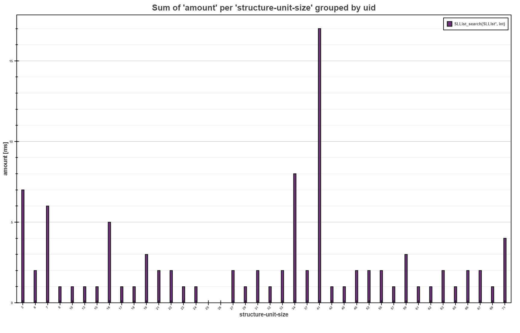
The Bars Plot above shows the overall sum of the running times for each
structure-unit-size for the SLList_search function collected by
Trace Collector. The interpretation highlights that the most of the consumed running
time were over the single linked lists with 41 elements.
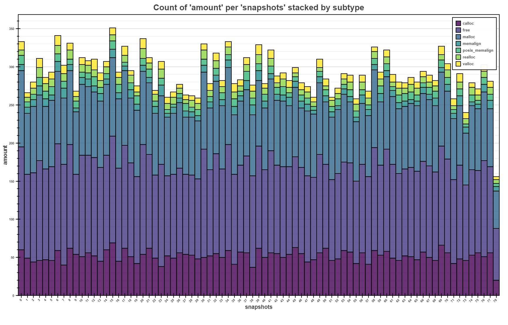
The bars above shows the stacked view of number of memory allocations made per each snapshot
(with sampling of 1 second). Each bar shows overall number of memory operations, as well as
proportional representation of different types of memory (de)allocation. It can also be seen that
free is called approximately the same time as allocations, which signifies that everything was
probably freed.
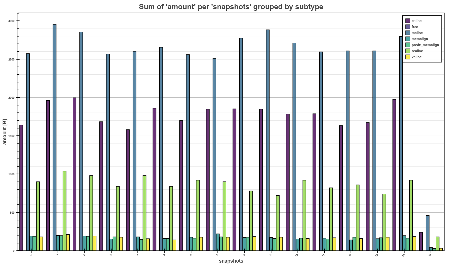
The bars above shows the grouped view of sum of memory allocation of the same type per each
snapshot (with sampling of 0.5 seconds). Grouped pars allows fast comparison of total amounts
between different types. E.g. malloc seems to allocated the most memory per each snapshot.
Flame Graph
Flame graph shows the relative consumption of resources w.r.t. to the trace of the resource origin. Currently it is limited to memory profiles (however, the generalization of the module is in plan). The usage of flame graphs is for faster localization of resource consumption hot spots and bottlenecks.
Overview and Command Line Interface
perun show flamegraph
Flame graph interprets the relative and inclusive presence of the resources according to the stack depth of the origin of resources.
Flame graph intends to quickly identify hotspots, that are the source of the resource consumption complexity. On X axis, a relative consumption of the data is depicted, while on Y axis a stack depth is displayed. The wider the bars are on the X axis are, the more the function consumed resources relative to others.
Acknowledgements: Big thanks to Brendan Gregg for creating the original perl script for creating flame graphs w.r.t simple format. If you like this visualization technique, please check out this guy’s site (https://brendangregg.com) for more information about performance, profiling and useful talks and visualization techniques!
The example output of the flamegraph is more or less as follows:
                    `
                    -                         .
                    `                         |
                    -              ..         |     .
                    `              ||         |     |
                    -              ||        ||    ||
                    `            |%%|       |--|  |!|
                    -     |## g() ##|     |#g()#|***|
                    ` |&&&& f() &&&&|===== h() =====|
                    +````||````||````||````||````||````
Refer to Flame Graph for more thorough description and
examples of the interpretation technique. Refer to
perun.profile.convert.to_flame_graph_format() for more details how
the profiles are converted to the flame graph format.
Usage
perun show flamegraph [OPTIONS]
Options
- -f, --filename <filename>
Sets the output file of the resulting flame graph.
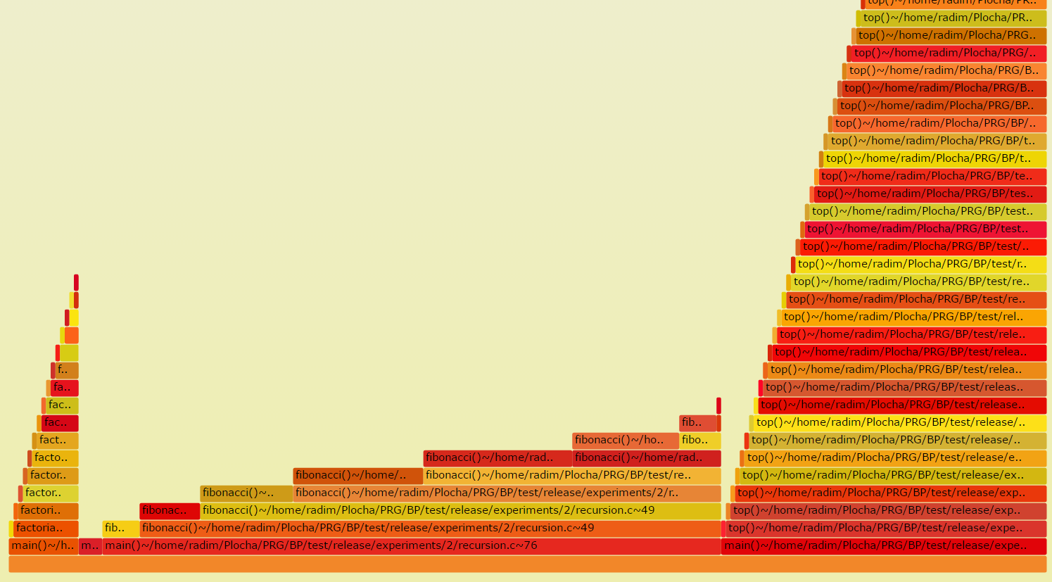
The Flame Graph is an efficient visualization of inclusive consumption of resources. The width of the base of one flame shows the bottleneck and hotspots of profiled binaries.
Examples of Output
Flow Plot
Flow graphs displays resources as classic plots, with moderate customization possibilities (regarding the sources for axes, or grouping keys). The output backend of Flow is both Bokeh and ncurses (with limited possibilities though). Bokeh graphs support either the classic display of resources (graphs will overlap) or in stacked format (graphs of different groups will be stacked on top of each other).
Overview and Command Line Interface
perun show flow
Customizable interpretation of resources using the flow format.
Flow graph shows the values resources depending on the independent
variable as basic graph. For each group of resources identified by unique
value of <by> key, one graph shows the dependency of <of> values
aggregated by <func> depending on the <through> key. Moreover, the
values can either be accumulated (this way when displaying the value of ‘n’
on x-axis, we accumulate the sum of all values for all m < n) or stacked,
where the graphs are output on each other and then one can see the overall
trend through all the groups and proportions between each of the group.
Bokeh library is the current interpretation backend, which generates HTML files, that can be opened directly in the browser. Resulting graphs can be further customized by adding custom labels for axes, custom graph title or different graph width.
Example 1. The following will show the average amount (in this case the function running time) of each function depending on the size of the structure over which the given function operated:
perun show 0@i flow mean --of 'amount' --per 'structure-unit-size'
    --accumulated --by 'uid'
The example output of the bars is as follows:
                                <graph_title>
                        `
                        -                      ______    ````````
                        `                _____/          ` # \  `
                        -               /          __    ` @  }->  <by>
                        `          ____/      ____/      ` & /  `
        <func>(<of>)    -      ___/       ___/           ````````
                        `  ___/    ______/       ____
                        -/  ______/        _____/
                        `__/______________/
                        +````||````||````||````||````

                                  <through>
Refer to Flow Plot for more thorough description and example of flow interpretation possibilities.
Usage
perun show flow [OPTIONS] <aggregation_function>
Options
- -o, --of <of_resource_key>
Required Sets key that is source of the data for the flow, i.e. what will be displayed on Y axis, e.g. the amount of resources.
- -t, --through <through_key>
Sets key that is source of the data value, i.e. the independent variable, like e.g. snapshots or size of the structure.
- -b, --by <by_resource_key>
Required For each <by_resource_key> one graph will be output, e.g. for each subtype or for each location of resource.
- -s, --stacked
Will stack the y axis values for different <by> keys on top of each other. Additionally shows the sum of the values.
- --accumulate, --no-accumulate
Will accumulate the values for all previous values of X axis.
- -f, --filename <html>
Sets the outputs for the graph to the file.
- -xl, --x-axis-label <text>
Sets the custom label on the X axis of the flow graph.
- -yl, --y-axis-label <text>
Sets the custom label on the Y axis of the flow graph.
- -gt, --graph-title <text>
Sets the custom title of the flow graph.
- -v, --view-in-browser
The generated graph will be immediately opened in the browser (firefox will be used).
Arguments
- <aggregation_function>
Optional argument
Examples of Output
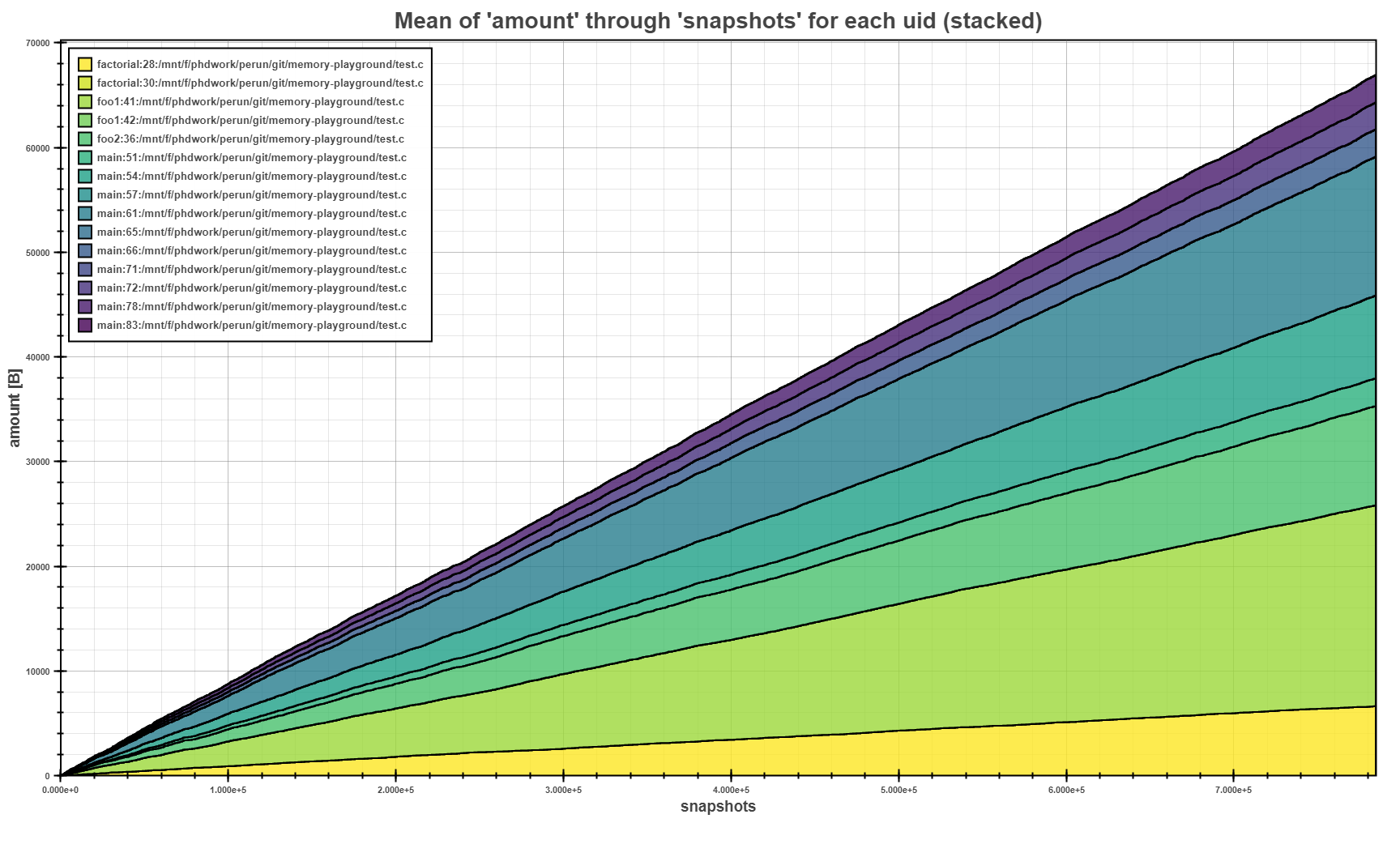
The Flow Plot above shows the mean of allocated amounts per each allocation site (i.e.
uid) in stacked mode. The stacking of the means clearly shows, where the biggest allocations
where made during the program run.
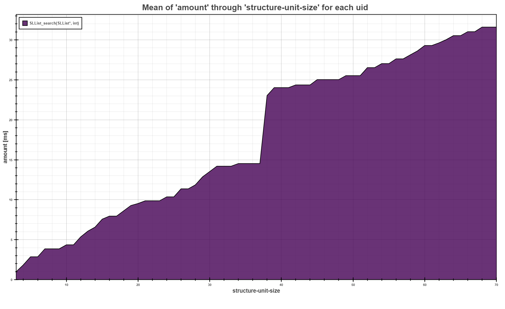
The Flow Plot above shows the trend of the average running time of the SLList_search
function depending on the size of the structure we execute the search on.
Scatter Plot
Scatter plot visualizes the data as points on two-dimensional grid, with moderate customization possibilities. This visualization also display regression models, if the input profile was postprocessed by Regression Analysis. The output backend of Scatter plot is Bokeh library.
Overview and Command Line Interface
perun show scatter
Interactive visualization of resources and models in scatter plot format.
Scatter plot shows resources as points according to the given parameters. The plot interprets <per> and <of> as x, y coordinates for the points. The scatter plot also displays models located in the profile as a curves/lines.
Features in progress:
uid filters
models filters
multiple graphs interpretation
Graphs are displayed using the Bokeh library and can be further customized by adding custom labels for axis, custom graph title and different graph width.
The example output of the scatter is as follows:
                          <graph_title>
                  `                         o
                  -                        /
                  `                       /o       ```````````````````
                  -                     _/         `  o o = <points> `
                  `                   _- o         `    _             `
    <of>          -               __--o            `  _-  = <models> `
                  `    _______--o- o               `                 `
                  -    o  o  o                     ```````````````````
                  `
                  +````||````||````||````||````

                              <per>
Refer to Scatter Plot for more thorough description and example of scatter interpretation possibilities. For more thorough explanation of regression analysis and models refer to Regression Analysis.
Usage
perun show scatter [OPTIONS]
Options
- -o, --of <of_key>
Data source for the scatter plot, i.e. what will be displayed on Y axis.
- Default:
'amount'
- -p, --per <per_key>
Keys that will be displayed on X axis of the scatter plot.
- Default:
'structure-unit-size'
- -f, --filename <html>
Outputs the graph to the file specified by filename.
- -xl, --x-axis-label <text>
Label on the X axis of the scatter plot.
- -yl, --y-axis-label <text>
Label on the Y axis of the scatter plot.
- -gt, --graph-title <text>
Title of the scatter plot.
- -v, --view-in-browser
Will show the graph in browser.
Examples of Output
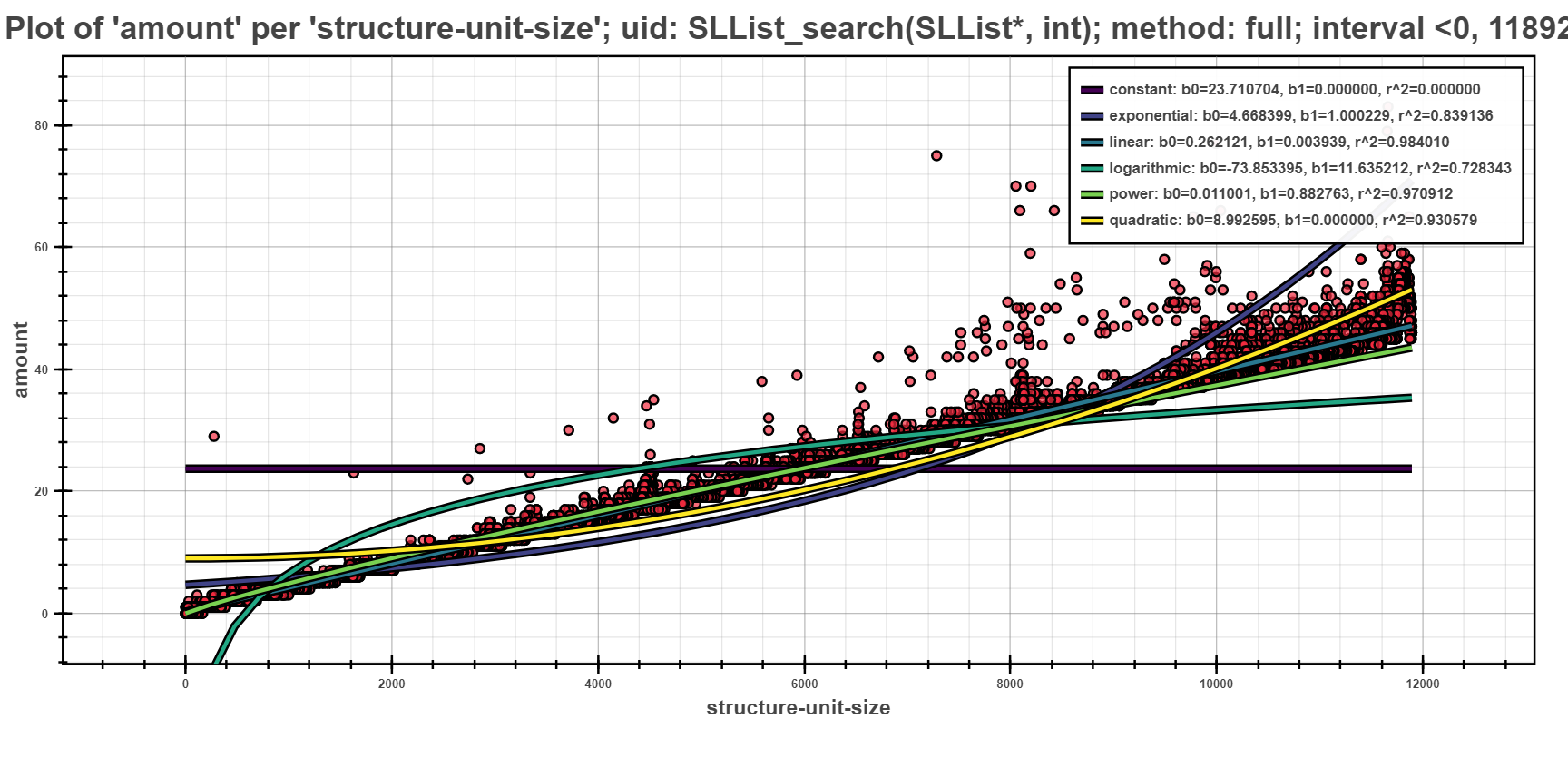
The Scatter Plot above shows the interpreted models of different complexity example, computed using the full computation method. In the picture, one can see that the depedency of running time based on the structural size is best fitted by linear models.
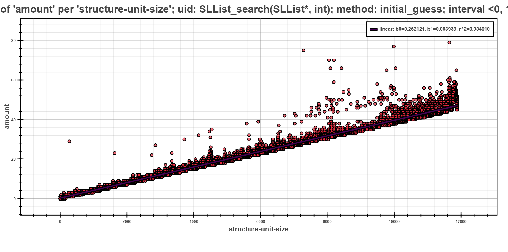
The next scatter plot displays the same data as previous, but regressed using the initial guess strategy. This strategy first does a computation of all models on small sample of data points. Such computation yields initial estimate of fitness of models (the initial sample is selected by random). The best fitted model is then chosen and fully computed on the rest of the data points.
The picture shows only one model, namely linear which was fully computed to best fit the given data points. The rest of the models had worse estimation and hence was not computed at all.
Table Of
Table interprets the data as a two dimensional array. The cells in the table can be limited to certain columns only and allow output to the file.
Overview and Command Line Interface
perun show tableof
Textual representation of the profile as a table.
The table is formatted using the tabulate library. Currently, we support only the simplest form, and allow output to file.
The example output of the tableof is as follows:
    uid                          model           r_square
    ---------------------------  -----------  -----------
    SLlist_insert(SLlist*, int)  logarithmic  0.000870412
    SLlist_insert(SLlist*, int)  linear       0.001756
    SLlist_insert(SLlist*, int)  quadratic    0.00199925
    SLlist_insert(SLlist*, int)  power        0.00348063
    SLlist_insert(SLlist*, int)  exponential  0.00707644
    SLlist_search(SLlist*, int)  constant     0.0114714
    SLlist_search(SLlist*, int)  logarithmic  0.728343
    SLlist_search(SLlist*, int)  exponential  0.839136
    SLlist_search(SLlist*, int)  power        0.970912
    SLlist_search(SLlist*, int)  linear       0.98401
    SLlist_search(SLlist*, int)  quadratic    0.984263
    SLlist_insert(SLlist*, int)  constant     1
Refer to Table Of for more thorough description and example of table interpretation possibilities.
Usage
perun show tableof [OPTIONS] COMMAND [ARGS]...
Options
- -tf, --to-file
The table will be saved into a file. By default, the name of the output file is automatically generated, unless –output-file option does not specify the name of the output file.
- -ts, --to-stdout
The table will be output to standard output.
- -of, --output-file <output_file>
Target output file, where the transformed table will be saved.
- -f, --format <tablefmt>
Format of the outputted table
- Options:
asciidoc | colon_grid | double_grid | double_outline | fancy_grid | fancy_outline | github | grid | heavy_grid | heavy_outline | html | jira | latex | latex_booktabs | latex_longtable | latex_raw | mediawiki | mixed_grid | mixed_outline | moinmoin | orgtbl | outline | pipe | plain | presto | pretty | psql | rounded_grid | rounded_outline | rst | simple | simple_grid | simple_outline | textile | tsv | unsafehtml | youtrack
Commands
- models
Outputs the models of the profile as a table
- resources
Outputs the resources of the profile as a…
perun show tableof resources
Outputs the resources of the profile as a table
Usage
perun show tableof resources [OPTIONS]
Options
- --headers <key>
Sets the headers that will be displayed in the table. If none are stated then all of the headers will be output
- -s, --sort-by <key>
Sorts the table by <key>.
- -f, --filter-by <key> <value>
Filters the table to rows, where <key> == <value>. If the –filter is set several times, then rows satisfying all rules will be selected for different keys; and the rows satisfying some rule will be selected for same key.
perun show tableof models
Outputs the models of the profile as a table
Usage
perun show tableof models [OPTIONS]
Options
- --headers <key>
Sets the headers that will be displayed in the table. If none are stated then all of the headers will be output
- -s, --sort-by <key>
Sorts the table by <key>.
- -f, --filter-by <key> <value>
Filters the table to rows, where <key> == <value>. If the –filter is set several times, then rows satisfying all rules will be selected for different keys; and the rows satisfying some rule will be selected for same key.
Examples of Output
In the following, we show several outputs of the Table Of.
 1uid            model           coeffs:b1    coeffs:b0     r_square
 2-------------  -----------  ------------  -----------  -----------
 3SLList_insert  logarithmic   0.0240681      0.362624   0.000870412
 4SLList_insert  linear        9.93516e-06    0.505375   0.001756
 5SLList_insert  power         0.00978141     0.93533    0.00348063
 6SLList_insert  exponential   1              0.990979   0.00707644
 7SLList_search  constant      0             23.7107     0.0114714
 8SLList_search  logarithmic  11.6352       -73.8534     0.728343
 9SLList_search  exponential   1.00023        4.6684     0.839136
10SLList_search  power         0.882763       0.0110015  0.970912
11SLList_search  linear        0.00393897     0.262121   0.98401
12SLList_insert  constant      0              0.56445    1
The table above shows list of models for SLList_insert and SLList_search functions for Singly-linked List implementation of test complexity repository sorted by the value of coefficient of determination r_square (see Regression Analysis for more details about models and coefficient of determination). For each type of model (e.g. linear) we list the value of its coefficients (e.g. for linear function b1 corresponds to the slope of the function and b0 to interception of the function).
From the measured data the insert is estimated to be constant and search to be linear.
 1uid:function          class
 2--------------------  -------
 3dwtint_decode_strip   O(n^2)
 4dwtint_decode_band    O(n^2)
 5dwtint_decode_block   O(n^2)
 6dwtint_encode_band    O(n^2)
 7dwtint_encode_block   O(n^2)
 8dwtint_weight_band    O(n^2)
 9dwtint_encode_strip   O(n^2)
10dwtint_unweight_band  O(n^2)
The second table shows list of function with quadratic complexities inferred by Bounds Collector for dwtint.c module of the CCSDS codec (will be publically available in near future). The rest of the function either could not be inferred (e.g. due to unsupported construction, or requiring more elaborate static resource bounds analysis—e.g. due to the missing heap analysis) or were linear or constant.
 1\begin{tabular}{llrr}
 2\hline
 3 uid              & model   &    coeffs:b1 &    r\_square \\
 4\hline
 5 test\_for\_static  & linear  &  3.36163e-08 & 4.46927e-07 \\
 6 expand\_tag\_fname & linear  &  7.3574e-08  & 2.32882e-06 \\
 7 vim\_strncpy      & linear  & -1.23499e-08 & 9.71476e-06 \\
 8 vim\_strsave      & linear  &  2.10692e-08 & 1.10401e-05 \\
 9 vim\_free         & linear  & -1.15839e-08 & 0.000216828 \\
10 parse\_tag\_line   & linear  &  1.04969e-06 & 0.004604    \\
11 vim\_strchr       & linear  & -8.84782e-08 & 0.00629398  \\
12 skiptowhite      & linear  & -0.00058116  & 0.00714483  \\
13 lalloc           & linear  & -1.19402e-07 & 0.0101609   \\
14 alloc            & linear  & -1.83755e-07 & 0.0136817   \\
15 ga\_grow          & linear  &  3.86559e-06 & 0.0160297   \\
16 vim\_regexec      & linear  &  2.398e-06   & 0.0161956   \\
17 ga\_clear         & linear  &  0.535088    & 0.0187932   \\
18 vim\_strnsave     & linear  & -0.000529842 & 0.0210357   \\
19 ga\_init2         & linear  &  0.00913043  & 0.0365217   \\
20 test\_for\_current & linear  &  1.00515e-05 & 0.126627    \\
21 skipwhite        & linear  &  4.98823e-06 & 0.192099    \\
22 vim\_isblankline  & linear  &  8.68793e-06 & 0.195017    \\
23 vim\_regfree      & linear  &  5           & 0.75        \\
24\hline
25\end{tabular}
The last example, shows list of estimated linear functions for vim v7.4.2293 sorted by coefficient of determination r_square. The output uses different format (latex).
Creating your own Visualization
New interpretation modules can be registered within Perun in several steps. The visualization methods has the least requirements and only needs to work over the profiles w.r.t. Specification of Profile Format and implement method for Click api in order to be used from command line.
You can register your new visualization as follows:
Run
perun utils create view myviewto generate a new modules inperun/viewdirectory with the following structure. The command takes a predefined templates for new visualization techniques and creates__init__.pyandrun.pyaccording to the supplied command line arguments (see Utility Commands for more information about interface ofperun utils createcommand):/perun |-- /view |-- /myview |-- __init__.py |-- run.py |-- /bars |-- /flamegraph |-- /flow |-- /scatterFirst, implement the
__init__.pyfile, including the module docstring with brief description of the visualization technique and definition of constants which has the following structure:1"""...""" 2 3SUPPORTED_PROFILES = ["mixed|memory|mixed"]
Next, in the
run.pyimplement module with the command line interface function, named the same as your visualization technique. This function is called from the command line asperun show ``perun show myviewand is based on Click library.Finally register your newly created module in
get_supported_module_nameslocated inperun.utils.common.cli_kit.py:1--- /home/runner/work/perun/perun/docs/_static/templates/supported_module_names.py 2+++ /home/runner/work/perun/perun/docs/_static/templates/supported_module_names_views.py 3@@ -18,5 +18,6 @@ 4 "flow", 5 "heapmap", 6 "scatter", 7+ "myview", 8 ], 9 }[package]
Preferably, verify that registering did not break anything in the Perun and if you are not using the developer installation, then reinstall Perun:
make test
make install
At this point you can start using your visualization either using
perun show.If you think your collector could help others, please, consider making Pull Request.